Why your website looks nothing like the Figma file
You signed off on the design. The website launched. But somewhere along the way, it quietly became something different.
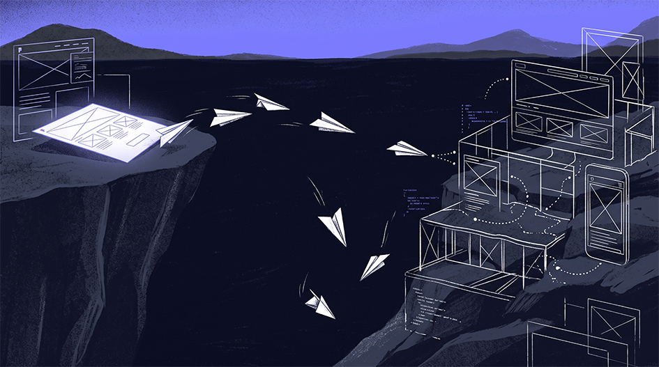
You approved the design. The site went live. Somewhere in the process, it quietly became something else.
The spacing is all wrong. The headings break in the most ridiculous places. On mobile, it looks half-done. The hero image, which was absolutely fine before, now cuts right through someone's face.
This can be very frustrating, and you’re not alone. It’s tough to see the final site fall short after all the work you've put into it. That feeling is normal, and we see it all the time.
A Figma file shows a snapshot of a website. But a real website is always changing. It grows, shrinks, loads, sometimes breaks, as it fills with real content and real users. For example, a text box that looks great with a short product name in the design might suddenly overflow or break if someone enters a longer name in real use. If the design only shows what the page looks like, the developer has to guess how it should work.
The gap between design and development isn’t about skills. It’s about handover. And it shows up in five common ways.
The five gaps
1. The design was made for one screen
The problem: Most website designs target one desktop size, maybe with a mobile version of the homepage. But your visitors use all kinds of screens: a 13-inch laptop, a wide monitor, a sideways tablet, or a phone with a cracked screen. Every size the designer skips is one the developer has to figure out.
The fix: Design for breakpoints, not just full pages. Each main template should show how it works on desktop and mobile, with notes about what stacks, hides, or shrinks in between.
2. The content was spot on. Real content isn't.
The problem: Real content does not fit perfectly. The product name might be twice as long, or one team member's bio might be three paragraphs. The image might be portrait rather than landscape. If the layout can't cope, it breaks.
The solution: Use real or realistic content in your designs. Try long titles, short titles and missing images. If your team will be updating the site in a CMS, your design needs to cope with whatever they actually enter. We recommend that clients provide real sample content wherever possible, like actual product names, bios, and images. If that's difficult, we can help adapt or create realistic content samples to make sure the designs are robust. Clear collaboration on content at this stage makes for a smoother handover and a better final result.
3. Nobody designed what happens next
The issue: A website is always in flux, while a design file captures a snapshot of the page. The questions we should ask are: What about when someone hovers over a button? What about when they submit a form with a field missing? What about when they do a search and find nothing? What about when they just sit and wait for a slow page to load? If you don't design for those scenarios, developers will use the default, and the default is almost never what you want.
The fix: Design every state, not just the 'perfect' one. Think about hover, focus, error, empty, loading and success. (We cover this in more detail in Why Your Design System Isn't Developer Friendly.)
4. The design ignored how the web actually works
The problem: Some designs look great in Figma but don’t work on a real website, for example, light grey text that fails accessibility checks, or effects that lag on an average phone. The developer has to choose between copying the design or building a site that works. The issue is with the design, not the developer.
The solution: Design using accessibility guidelines (WCAG 2.1 AA) and use a colour contrast checker to verify your work. Make use of 2-3 fonts that are actually needed. Ask yourself, "Is this actually slowing things down?" before you add anything.
5. The handover meeting was a file
The problem: The designer sends a link, the developer opens it weeks later, and whoever works on it has no idea what's missing. It may look absolutely perfect in pixels, but you can't actually build it.
The fix: Involve developers before the design is complete, not after. Add notes to explain your decisions. Hand over a system of components, tokens and specs rather than just a set of nice screens.
How we close the gap
The good news is that we can close all of these gaps. Most can be solved before any code is written.
That’s why we treat design and development as one process, not two separate projects. At Inkblot, one team handles both and speaks the same language.
- We prioritise structure before style. We start with information architecture and desktop and mobile wireframes, with notes, so every layout decision is intentional.
- We build a system, not just a stack of screens. Every project gets a component library with reusable elements and design tokens, so we don't design and build what we use once.
- We specify every state. We design and document hover effects, form behaviours, errors, and micro-interactions instead of leaving them to chance.
- Our developers are involved early. They see the design while it’s still flexible, and they build with Astro to keep sites fast and easy to update.
- We deliver with answers. Our developer docs cover spacing, typography, colour, and responsive behaviour. We also provide two weeks of post-launch support to catch anything real users notice. After that period, we are still available for ongoing support and further improvements through our standard support plans, so you always know where to turn if new questions come up.
We do this not because the process is exciting, but because the website you approve should be the website you actually get.
Here's the three-question test
Before your next website goes into development, open the design and ask yourself:
- What does this page look like on a phone?
- What happens when the heading is twice as long?
- What does the form do when it fails?
If your design team can answer all three questions, you’re in good hands. If the answer is "the developer will figure it out," you’ve just found your gap. When you spot a gap, raise it with your team or ask your agency for clarification. Acting early may prevent bigger issues later and help ensure the final site matches your expectations.
A Figma file shows what you want. The handover decides what you actually get.
Design the behaviour, not just the look.