Project Overview
The client
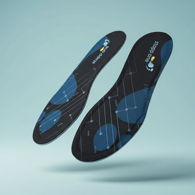
Stapp One makes wearable sensor insoles, paired with a mobile app and a web platform, that record, visualise and analyse how a person walks. Its users include clinicians, rehabilitation teams, researchers, and the patients they treat. The product has been validated with more than 160 medical experts and 39 rehabilitation centres and clinics across Austria, Germany and Switzerland.
The project
We were brought in to rethink the UX and UI and redesign the full gait-analysis experience across mobile and web. This included mapping user journeys for medical, research, and rehab scenarios; writing clear user stories as product requirements for developers; delivering high-fidelity designs for both platforms; and building a unified design system.
The situation
The clinical partnerships were solid, but the day-to-day use was not. Bluetooth issues were a constant source of 3-8 minutes of troubleshooting per patient in back-to-back assessments. Clinicians often gave up mid-assessment and went back to phone recording and paper notes. That meant the product was losing the very people it had worked so hard to earn trust from.
The Brief and the Reframe
The ask was to improve the gait-analysis experience across mobile and web: make it easier to record, sync and review data, and give patients clearer feedback on their recovery.
The original version interface was easy to read as a usability brief. The screens were dense, the video was small, and the heatmaps were hard to read. But the clinicians weren't leaving because of how the product looked. They were leaving because a session could fall apart halfway through: insoles disconnecting mid-reco
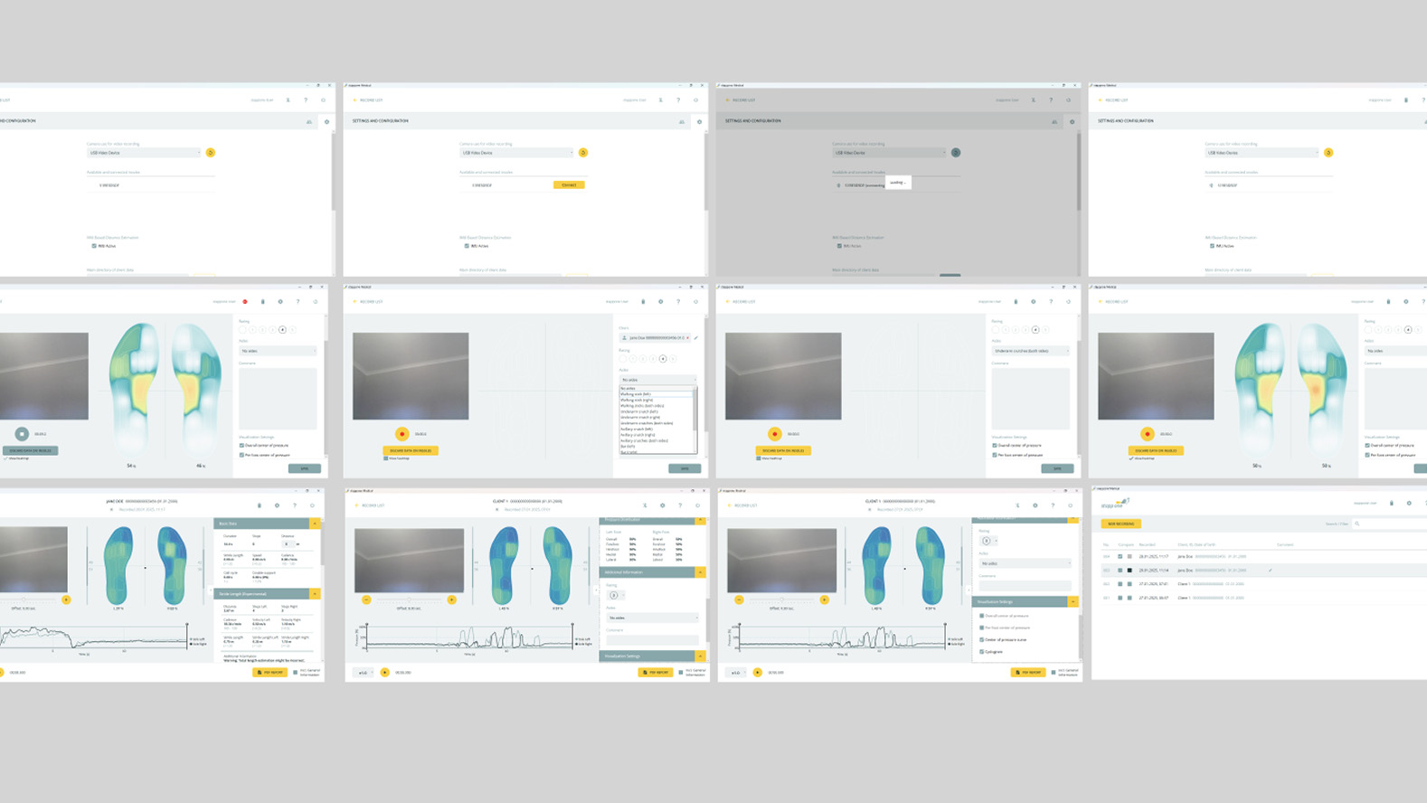
rding, syncs with no sign of progress, and data lost with no way back.
And two of the causes couldn't be engineered away. Sync time could not be shortened, and the insoles had to reconnect before a recording could end. So the real brief wasn't to make the interface clearer. It was to make a session reliable on hardware whose limits were fixed, and to do it in the interface.
The friction points came down to six things:
- Disconnections mid-recording, with data lost if the insoles dropped out
- Slow updating with no clear progress
- No way to segment tasks or mark activities
- Small video and few visual tools for explaining results to a patient
- No way to prepare a client before connecting the insoles
- Different behaviour on mobile and desktop
Discovery: Three Users, One Session
We started by producing a Voice of Customer report, gathering what clinicians, researchers and rehab teams were experiencing in practice.
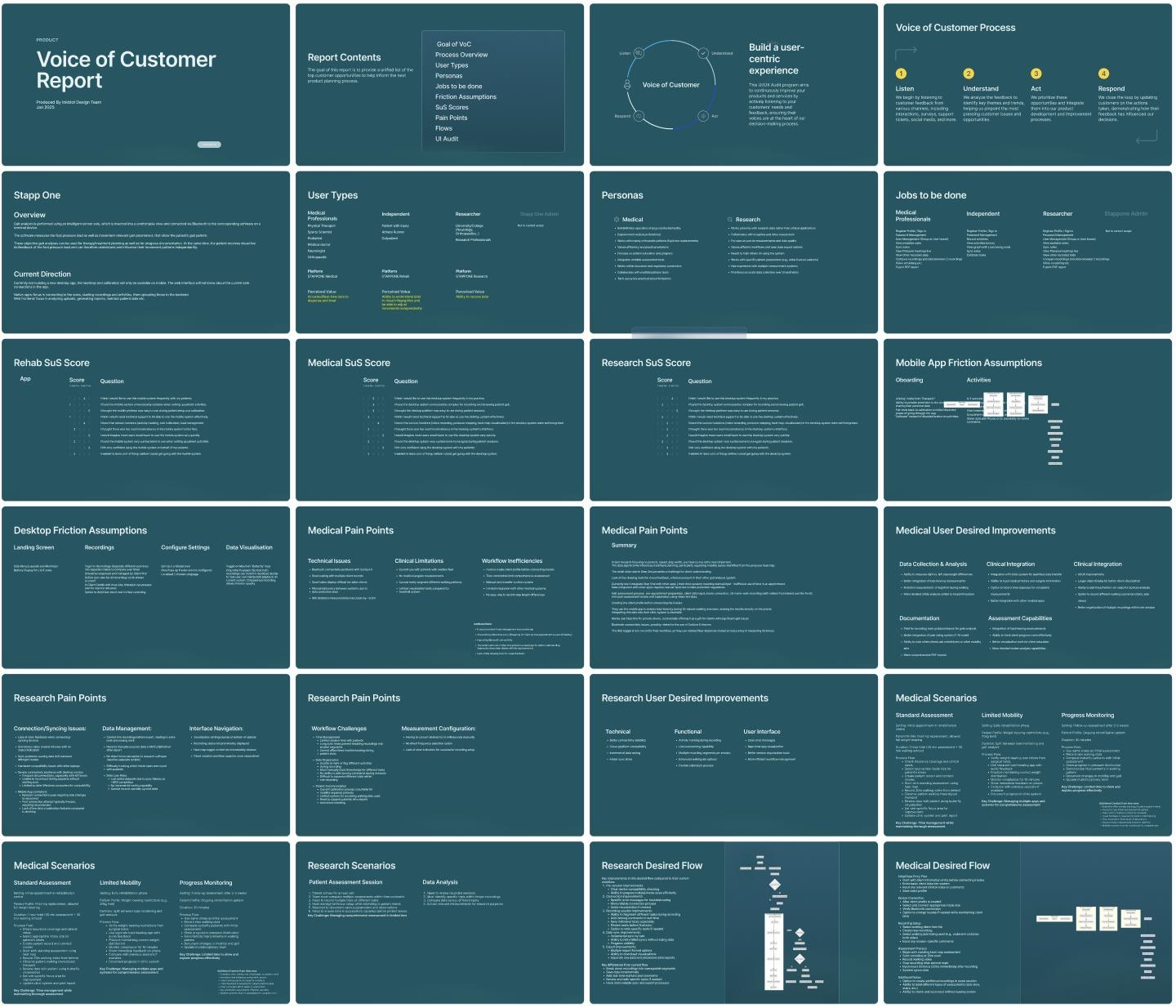
Mapping the journeys made one thing clear: a single gait session serves three people with very different jobs.
- The administrator manages the platform behind the scenes.
- The practitioner runs an assessment against the clock, with a patient on the treadmill and the next one waiting.
- The rehab patient wants to understand their own progress and stay motivated.
The practitioner's journey carried the most risk. Every reconnect, every unexplained wait and every lost recording landed on them, in front of a patient. That made it the hardest journey to design, with the other two shaped around it.
The Strategy
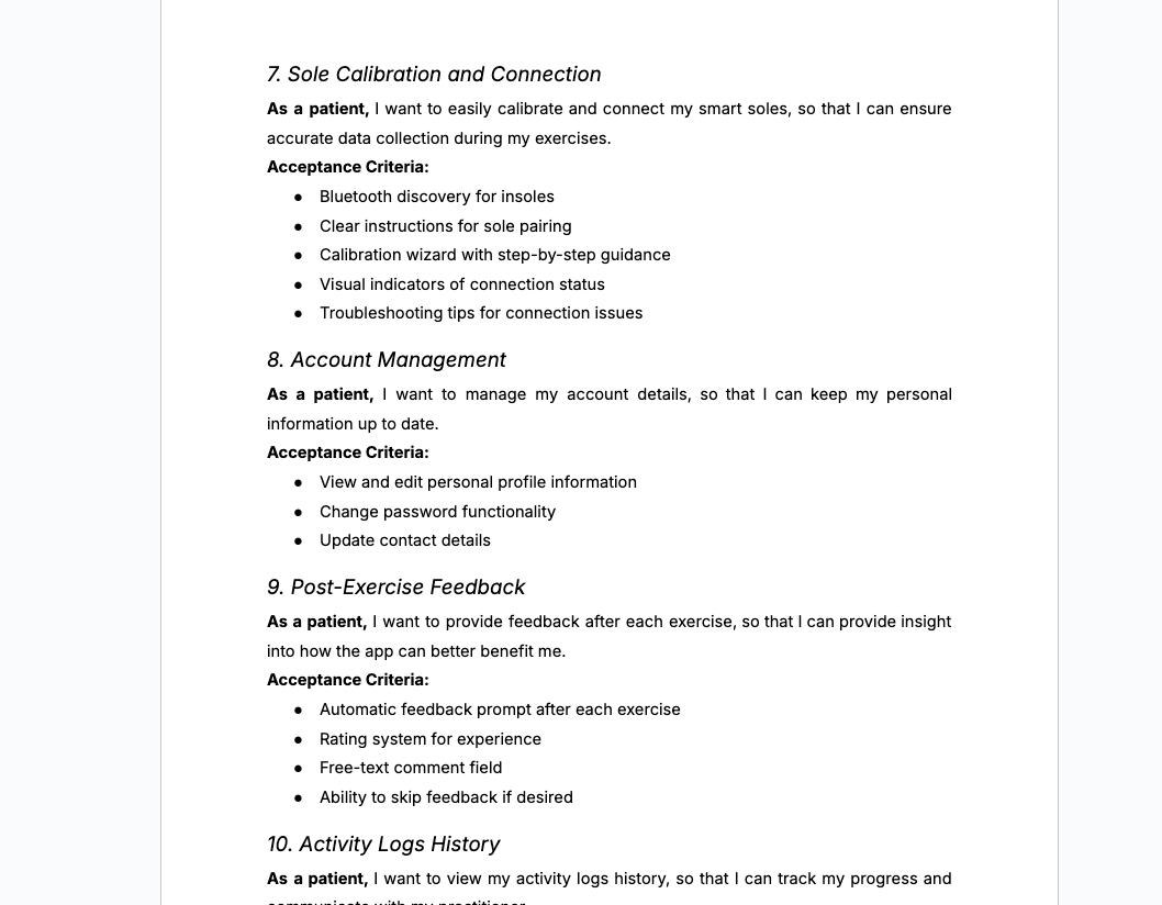
We followed one main principle: design for the hardware’s limits, but don’t let those limits become the clinician’s problem. If a task didn’t need to happen during recording, we moved it elsewhere. If a step like reconnecting or a long sync couldn’t be avoided, we made it clear and easy to recover from, not a roadblock. We turned every workflow improvement into a user story with clear acceptance criteria. This gave the development team requirements they could build and test—real scenarios, not just screens.
Design: The Decisions That Moulded It
The redesign follows the order of a real appointment: prepare the client, record, sync, then review with the patient. Four decisions carry the rest.
1. Reconnects became part of the flow, not a dead end.
The insoles needed to reconnect before ending a recording, and we couldn’t change that. In the old process, a dropout meant troubleshooting or starting over. We created reconnect screens that appear during recording with clear instructions so that clinicians can reconnect and continue. This adds a step they can’t skip, but it protects the data and prevents sessions from restarting.
2. Syncing moved into the background.
Sync time couldn’t be made faster either. Instead of making clinicians wait, we designed background syncing with visible progress, paused-sync states, and actions that don’t block the next task. The sync still takes the same time, but clinicians don’t have to watch it.
3. Activity tagging moved to after the sync.
Tagging activities during recording seems efficient, but it forces clinicians to watch the patient, the screen, and a timer all at once. By moving tagging to after syncing, we took that pressure off recording and gave researchers more accurate markers, based on complete data instead of guesses.
4. Preparation happens before the insoles connect.
In the old process, clinicians couldn’t set up a client before connecting the insoles, so setup and connection happened at the same time. We redesigned the workflow so clinicians can complete all preparation first, making connection the final step before recording instead of the first.
The thread that ties both together
The review stage is where clinicians explain results to patients, so we designed it for that conversation. It now has a larger video preview, annotation tools, clearer heatmaps, the centre-of-pressure "butterfly" pattern, step-length cues, and side-by-side session comparisons. The unified design system uses the same patterns on mobile and web, so once a clinician learns one, they know both.
Outcomes
The results so far come from early prototype testing, ahead of [CONFIRM: launch status].
- 3 to 8 minutes back per appointment. That is the reconnection troubleshooting time clinicians no longer lose, between 5% and 13% of an appointment.
- 25% to 30% less time on the whole task. The wider workflow changes cut overall task time by this much in early prototype testing.
- No more lost recordings. The in-flow reconnect and incremental sync are designed so that a dropout no longer costs the session's data.
- A foundation for what comes next. The design system is now the base for all future Stapp One products.
The clinicians' response was about the patients as much as the tool. As one medical practitioner put it: "Visualising their recovery progress this way is really going to empower them."
What We Learned
When hardware sets the limits, the interface is where dependability lives.
It's tempting to treat a slow sync or a forced reconnect as an engineering problem the design has to wait for. Here the limits were fixed, and the clinician's experience of them was not. Most of the time saved came from changing when and how people met the constraints, not from removing them.
Take everything out of the moment that can't be interrupted.
A recording with a patient on the treadmill is the one part of the session you can't pause and cheaply redo. Move tagging after the sync and setup, before the connection leaves that moment with one job. The same idea applies to any tool used under time pressure: find the moment you can't repeat, and protect it.
In a clinical tool, trust is a workflow problem before it is a visual one.
The product's look didn't put off the clinicians who went back to paper. They no longer trusted it to keep their data. Clearer visuals mattered, especially for explaining results to patients, but they only counted once the session itself was reliable.
Closing Reflection
Stapp One had already earned clinics' trust across three countries. The product's problem was keeping that trust on a busy Tuesday, one session at a time. The fix wasn't faster hardware or a prettier interface. It was a workflow that takes the hardware's limits seriously and stops passing them on to the person with a patient in front of them.
The result gives clinicians minutes back in every appointment, and gives patients a clearer picture of their own recovery. And because the improvements reached the developers as user stories, the design system the team now builds on carries that thinking into every product that follows.
[LIVE URL: Visit the Stapp One website.]