Project Overview
The client
H2O Go runs automatic teller water dispensers: self-service units in shopping malls that sell purified water, available 24 hours a day.
The project
Brand identity, illustration, vinyl wraps for the dispensers, the on-screen interface for each unit, and in-mall signage, banners and light-boxes.
The situation
H2O Go's customers are South Africans who have running water at home but don't trust its quality, and would rather buy treated water. They lead busy, active lives, and while bottled water is easy to find in shops, H2O Go presents something different: refill your own containers whenever you need to. No brand existed yet: the first job was to create one.
The Brief and the Reframe
The brief had two parts. Create a brand that would catch the attention of people walking past the ATM banks where the units would stand. And design graphics and an interface that guide people through buying water, with a process that feels intuitive.
It would have been natural to treat those as two jobs: a brand team on the logo and wrap, a UI team on the screen. But a self-service machine has no staff to explain it. Whoever walks up has only what's printed on the unit and what's on the screen. The wrap has to stop them, tell them what the machine is and show them how it works, and the screen has to finish the job without a single step that leaves them unsure.
So the real brief wasn't a brand plus an interface. It was one system, where the illustrations, the wrap and the screens all do the same work: getting a first-time user from "what is this?" to a full bottle without help.
The Strategy: Water for People on the Move
The audience shaped everything: families and active people with busy lives. The brand had to feel like it was for them: friendly, easy and on the move.
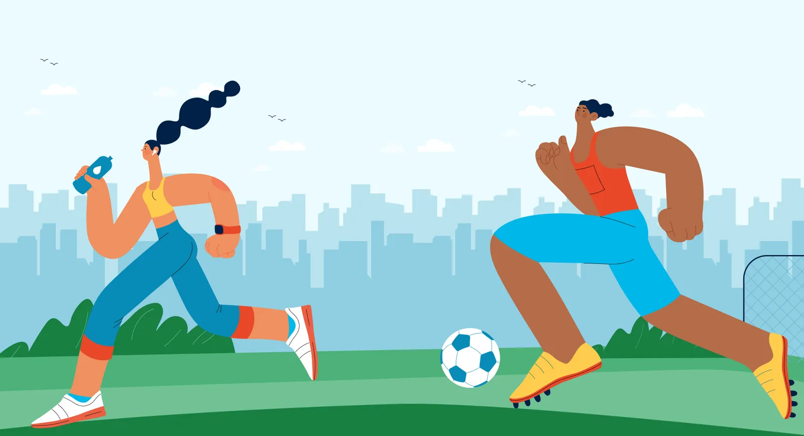
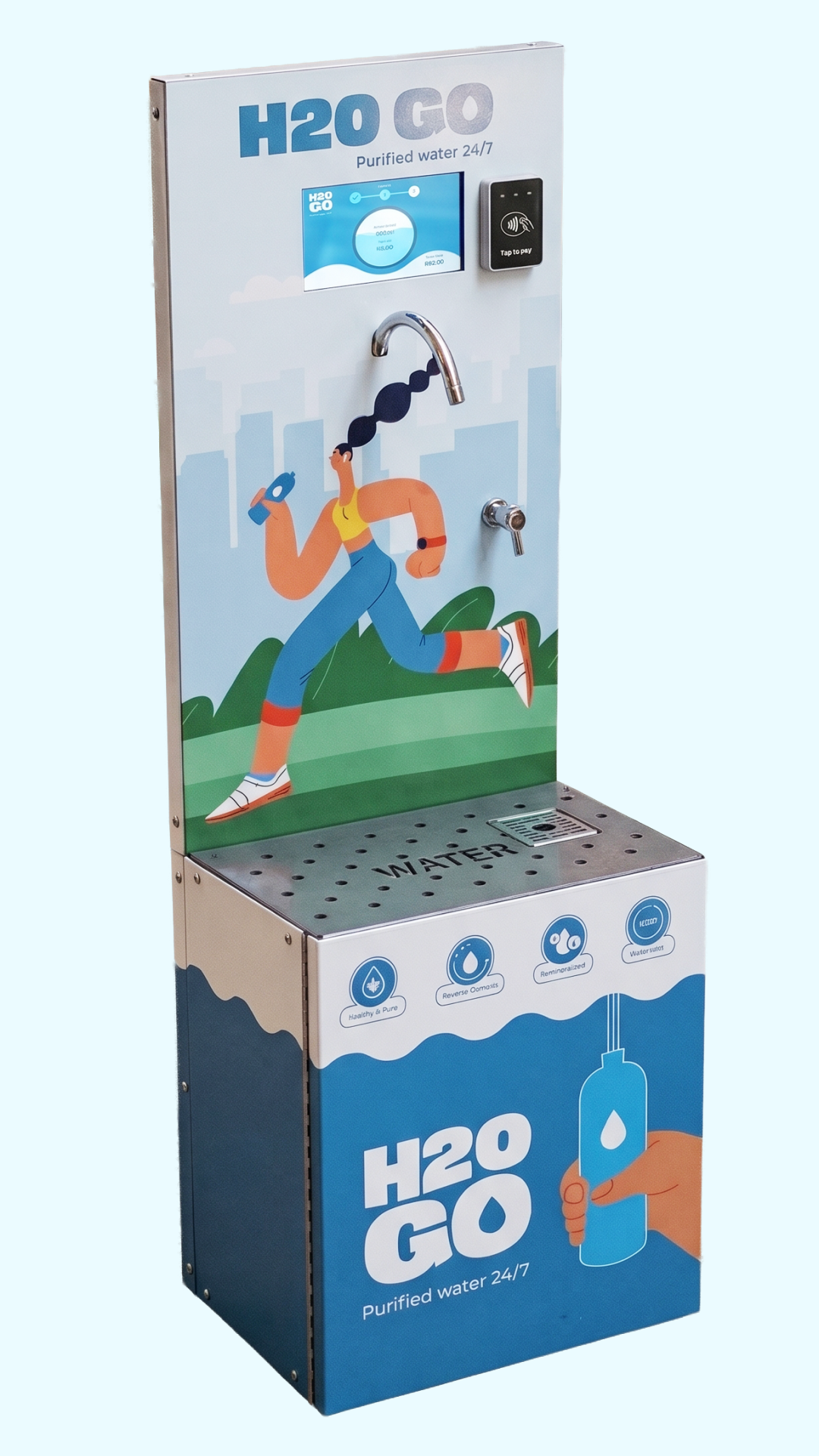
Treated water is easy to brand as clinical, all clean lines and laboratory reassurance. We went the other way. The identity pairs cool blues with contrasting pops of red, and uses an illustration style built on exaggerated characters and flowing shapes: people running, playing and drinking, so the brand says "keeping hydrated on the move" before anyone reads a word.
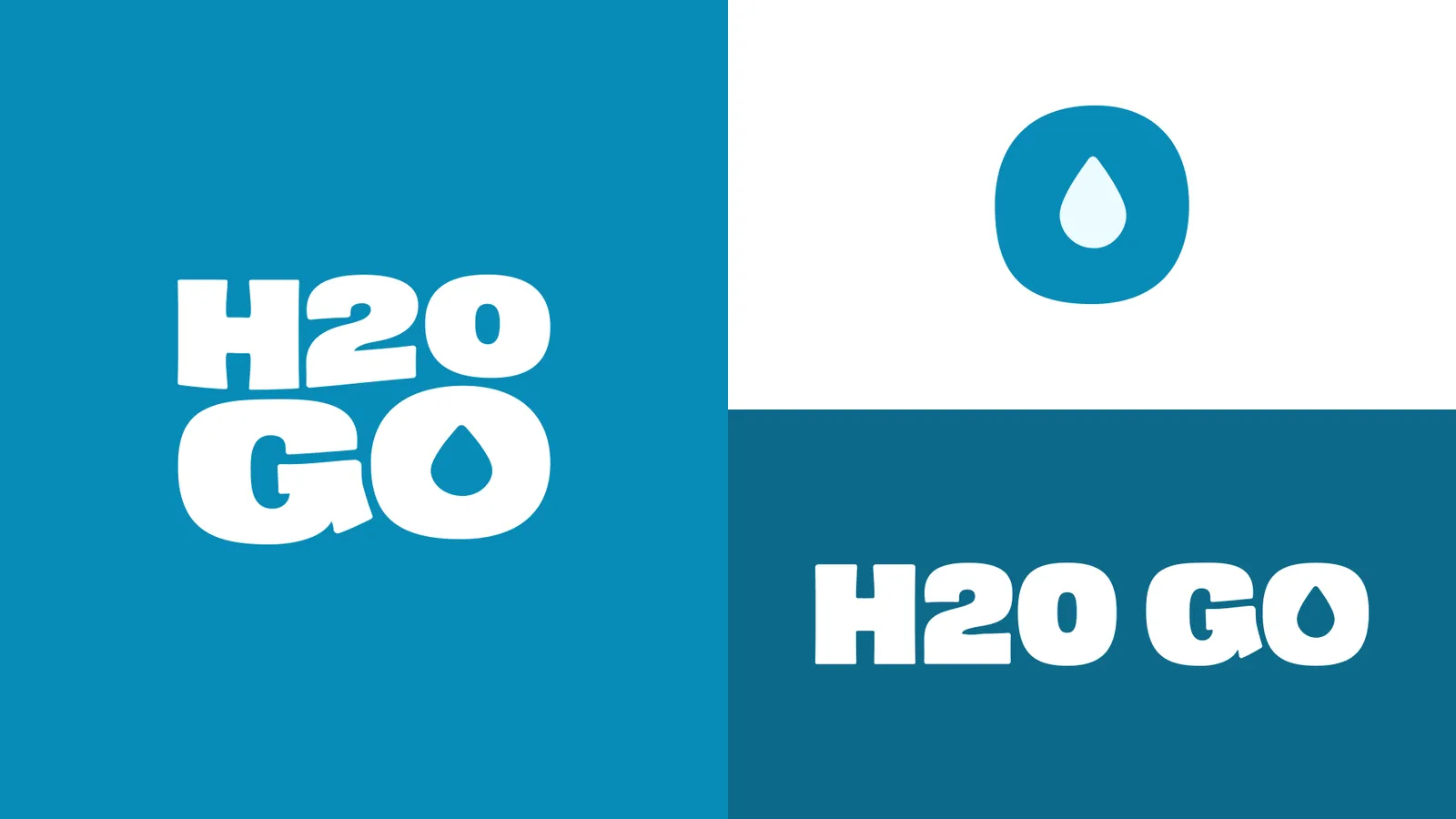
The wordmark is bold and simple, with a water drop in the O of Go, and a stacked version and drop icon for smaller spaces.
Design: The Decisions That Influenced It
1. The instructions are part of the brand.
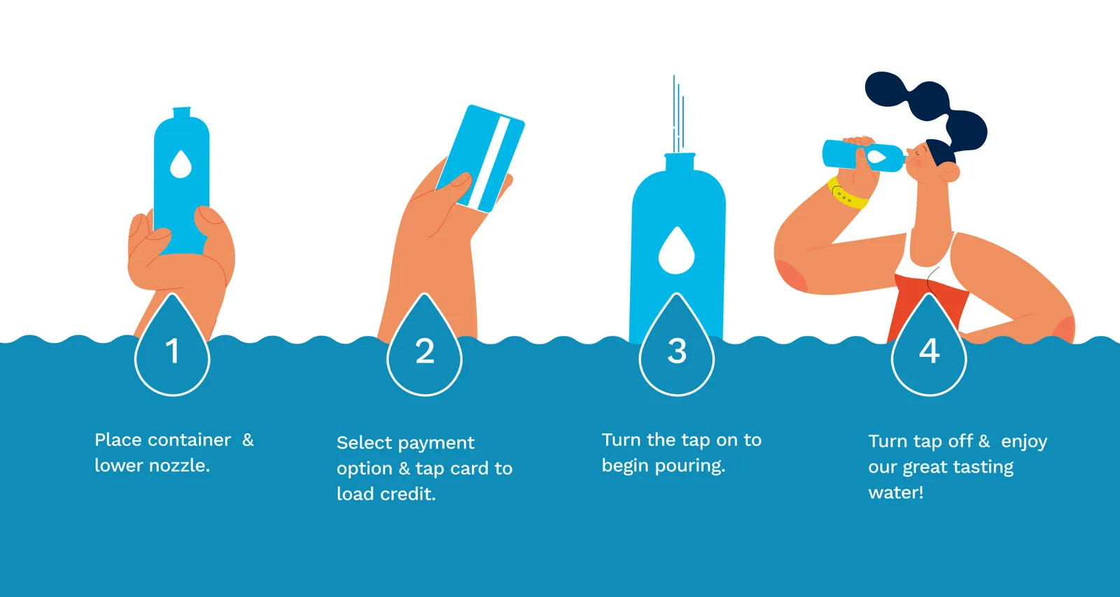
The four steps to buy water are printed on the unit as a loop of illustrations: place your container and lower the nozzle, choose a payment option and tap your card to load credit, turn the tap on, then turn it off and enjoy. The same characters that sell the brand show how to use it, so the instructions read as part of the design rather than a sign stuck on afterwards.
2. The screen only ever asks for one thing.
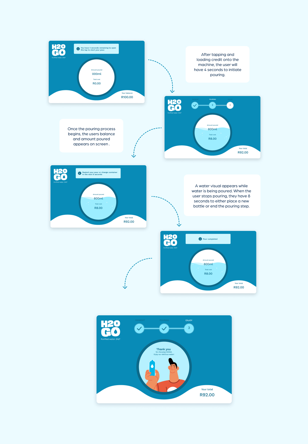
The interface follows three stages, shown as a progress bar: Payment, Pouring, Enjoy. Each screen holds one prompt and the numbers that matter at that moment, around a single circular display.
- After credit loads, the user has 4 seconds to open the tap, with a countdown on screen.
- While pouring, a water visual fills the circle, and the amount poured, the cost and the remaining balance update live.
- When they stop, they have 8 seconds to restart the pour or swap in a new container before the session ends.
- At the end, a thank-you screen shows the final total, and the system automatically refunds any unused credit to their account.
Short, visible windows mean the machine is never left in an unclear state, and the user always knows what it's waiting for.
3. The unit is the billboard.
H2O Go installs its dispensers alongside ATMs in shopping malls, putting them where people already stop and where it's safe and easy to fill containers and carry them to the car. The vinyl wrap does the job a billboard would: a large character in motion, the wordmark at eye level, and the promise "Purified water 24/7". Banners and light-boxes in the mall point people towards it.
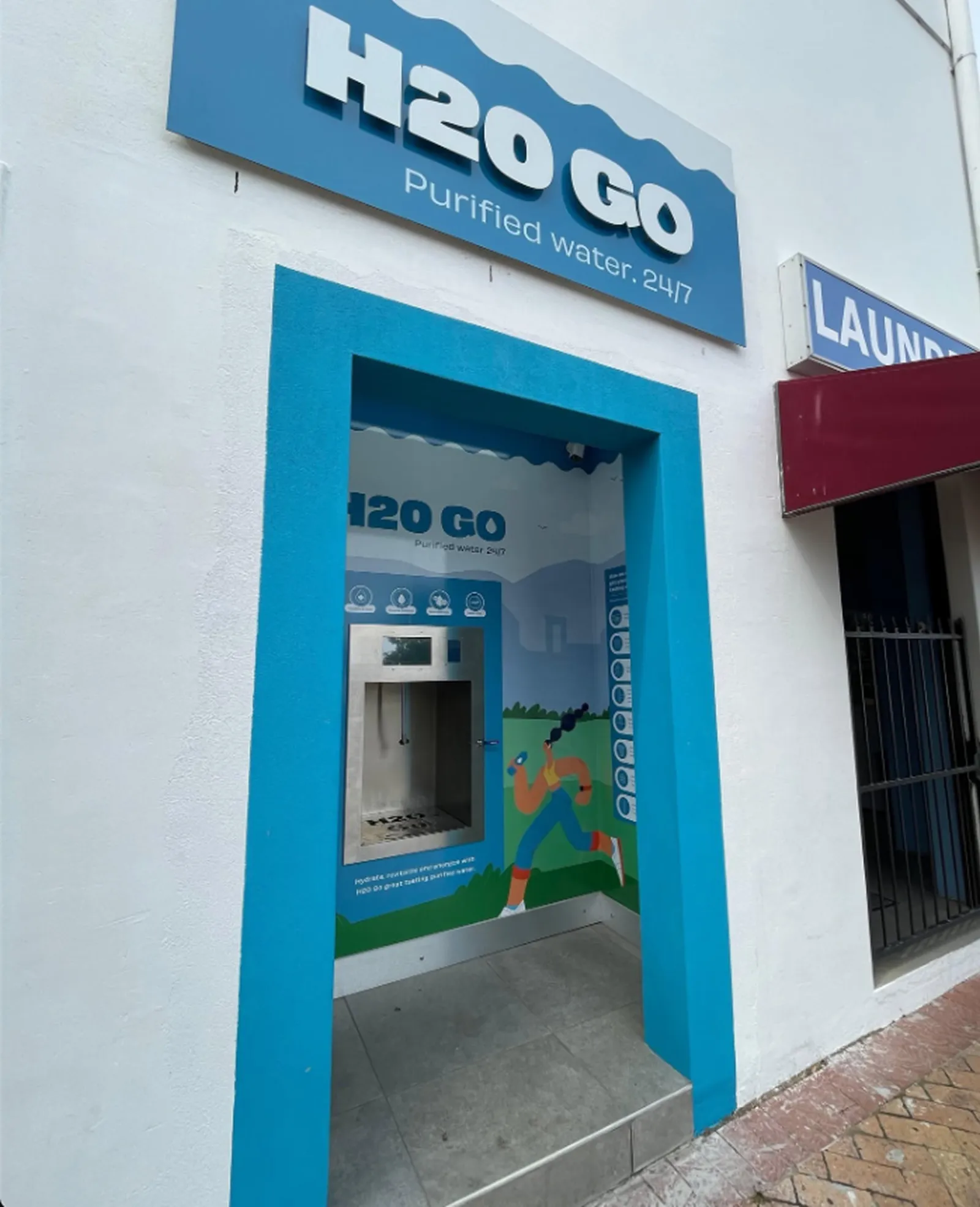
Out in the world, the idea carries past the unit itself. At this installation, the whole entrance becomes part of the brand: a wave-topped sign over the door, the doorway painted in H2O Go blue, and the wrapped dispenser set back inside a walk-in alcove, visible from the pavement.
Outcomes
[OUTCOMES: no results were recorded in the old piece. Add what can be shown, for example:]
- [METRIC: number of units installed, and in how many malls]
- [METRIC: litres poured or transactions per month]
- [METRIC: share of first-time users who complete a pour unaided]
[CLIENT QUOTE: from the H2O Go team.]
If no numbers are available, cut this section; the decisions can carry a project of this size on their own.
What We Learned
On a self-service product, the brand is the user manual.
No one stands beside the machine. Everything a first-time user needs (what it is, whether it's for them, what to do next) has to come from the wrap and the screen. Designing the identity and the interface as one system meant every illustration earned its place twice.
Fewer things on screen, more confidence at the tap.
A user with a container in one hand and a card in the other can't study a screen. One prompt per stage, a live total and a visible countdown gave them just enough to act without hesitating.
Closing Reflection
H2O Go's promise is simple: good water, any time, in your own container. The work was making that promise legible to a stranger walking past an ATM, and then keeping it simple all the way to a full bottle. The brand catches the eye, the characters explain the steps, and the screen asks for one thing at a time. Together they turn an unfamiliar machine into something anyone can walk up to and use.
[LIVE URL, if any]