The client
City Sightseeing South Africa is the official open-top Hop-on Hop-off operator in Cape Town and Johannesburg, with more than 20 years on the road. The red bus is the core product, and it feeds everything else: Cape Point and Winelands day tours, canal and harbour cruises, Cape Town passes and bus-linked combinations. Cape Town is roughly 90% of the business, and the customer mix sits at about 60% international and 40% local.
The project
A new website for a business that sells experiences, not information, taken from kickoff on 20 August 2026 to launch on 28 September 2026: just under six weeks. Our scope was the thinking and the design: wireframes, a compact design system and UI design across the key templates. Development was handled by a separate build partner CodeCollective.
The trigger
The trigger wasn't a broken bus. It was a platform the business had outgrown. The existing site had performance problems, deals were slipping through the gaps, and the team wanted to move to a new service provider. Every booking that went through an online travel agent or a third party instead of the official site was a margin and a customer relationship handed to someone else.
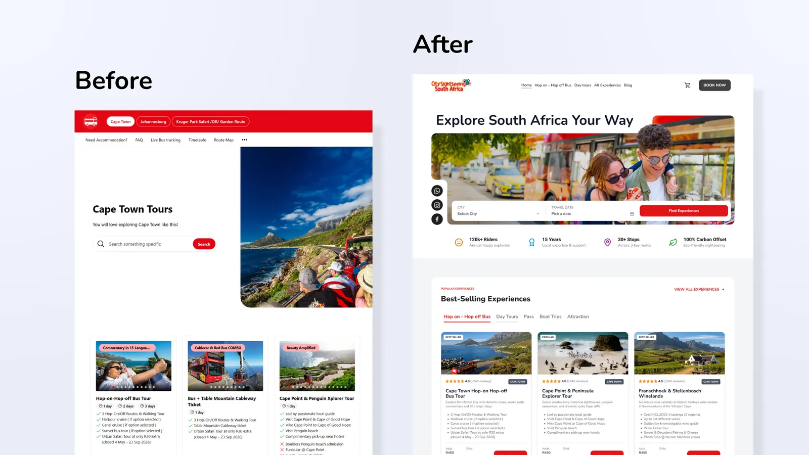
The Brief and the Reframe
The brief was clear: a site that looks fresh and inviting, with a backend that lets the team update products, prices and timetables without waiting on a developer. A reasonable ask, and one the new site answers.
But the kickoff answers pointed at something more interesting. City Sightseeing didn't just want more bookings. They wanted the website to take a bigger share of total sales, lean less on OTAs and the ticket office, and become the official, trusted source of information about their own products. If the site did that properly, it would cut the avoidable questions asked at the ticket office and strengthen how the business shows up in Google and in AI-generated travel recommendations.
So the real brief became this: help a visitor choose, trust and buy in a few taps, then keep helping them once they're on the bus. A fresh look was on the surface. Clarity was the job.
Discovery: The Visitor Is Already in Cape Town
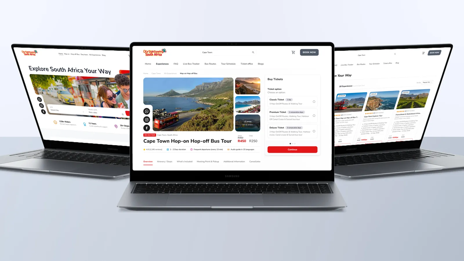
They're not planning a holiday. They're on it.
The most useful thing we learned had nothing to do with the old site's design. It was about timing. Most City Sightseeing customers buy once they're already in Cape Town, often within about three days of the tour, and roughly 75% of online purchases happen on a phone. Most arrive from Google straight onto a product page, not the homepage. AI tools are a small but fast-growing source of traffic.
That changes the design question. We weren't designing for someone browsing at a desk weeks ahead. We were designing for someone standing on a pavement in the Waterfront with a few minutes and a decision to make. Every page had to work as a front door.
The friction was in the choosing
The existing site had a few flow problems in the very first interaction on landing, pages that were effectively hidden, and links that went nowhere. The kickoff filled in the rest. There were too many products presented at once without a filter system. Ticket types, route access, validity and inclusions were hard to compare. Departure times, meeting points and redemption instructions were difficult to find. The same information was repeated in different places, and didn't always agree. And it wasn't always clear which experiences City Sightseeing runs itself and which come from partners.
None of that is a visual problem. It's a confidence problem. A visitor who can't tell what's included, or whether they're buying from the official operator, either asks at the ticket office or buys somewhere else.
The category sets a high bar
We looked closely at how the best operators and resellers handle the same job: Big Bus and Tootbus for operator-led product presentation and comparable ticket cards, Go City for destination and product clarity, and GetYourGuide and Viator for catalogue search and filtering. The resellers were more flexible in how people could browse. The operators were better at explaining the product itself. The whitespace was a site that did both, with the authority only the official operator can claim.
The Strategy
Four principles governed every decision that followed.
Lead with what City Sightseeing operates. The Red Bus first, then the operated experiences, with partner products available but clearly labelled and sitting below them. A hierarchy, not a catalogue.
One source of truth for every fact. Prices, routes, timetables, inclusions and meeting points live in one place and appear wherever they're needed. That's what keeps the information consistent for visitors, and it's what makes the site something Google and AI tools can trust.
Mobile is the main event. With three in four online purchases on a phone, the mobile journey wasn't an adaptation of the desktop one.
The site doesn't stop at checkout. Live bus information, stops, timetables and support had to be as easy to reach as the Book Now button, because many customers come back to the site mid-tour.
The constraint was time. Just under six weeks from kickoff to launch is a short runway, so we made a deliberate call: keep the bones of the existing information architecture, fix the journeys that were costing sales, and restructure only the pages that needed it. Not a reinvention. A focused repair of the moments that matter.
Design: The Decisions That Shaped It
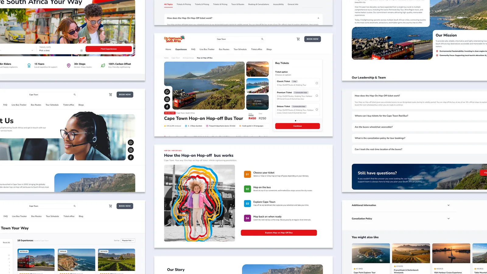
We started with wireframes built from the existing site, so the team could see exactly what was moving and why, and restructured pages only where the journey demanded it.
1. Prices up front, on every card
Every product card shows the adult and child price in rand before anyone clicks. Hiding prices until checkout is common in tourism, and it's a reliable source of drop-off. For a visitor deciding on the spot, seeing the number early isn't a risk to the sale. It's what makes the sale possible.
2. Choose by goal, not by feature list
The routes don't compete on stop counts alone. Each one carries an "Ideal for" line: the Red Route for first-time visitors after landmarks and beaches, the Purple Route for wine tasting. Experiences can also be browsed by interest (get on the water, taste the Winelands) or filtered by category. A four-step "How it works" section answers the first-timer's real question in plain language: choose a package, hop on, explore, hop back on. Decided buyers move fast. Undecided ones get help.
3. The site keeps working after the sale
The Live Bus Tracker sits in the main navigation, not buried in a footer. Timetables and interactive maps are a tap away, and WhatsApp sits alongside the other contact channels. These are small placements with a big job: they serve the customer standing at a bus stop, and every question the site answers is one the ticket office doesn't have to.
The look
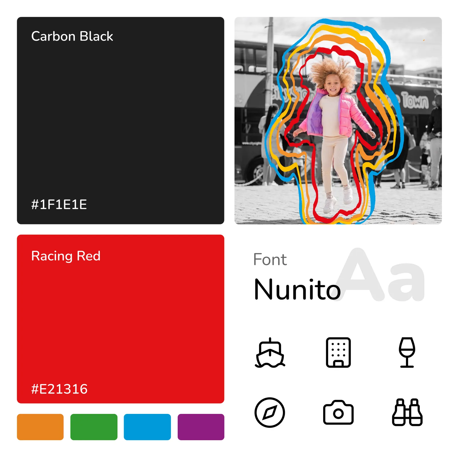
We built a compact design system that covered the essentials, rather than an encyclopaedia the team would never open. The hero does one thing: a real photo of people with the red bus, one headline, and a short city-and-date search that gets visitors to the right experiences. Trust signals do quiet work throughout: 20+ years of local experience, Cape Town Tourism and SATSA memberships, familiar payment logos, instant digital tickets and free cancellation up to 24 hours before travel.
The hardest design problem was colour. City Sightseeing's brand uses a lot of it, and several combinations failed accessibility contrast checks. We worked through each one so the brand stays recognisable and the text stays readable, in bright Cape Town sun, on a small screen.
What We Learned
In tourism, the point of sale is the pavement
It's tempting to treat a travel site as a mood board for the trip. The data said otherwise. When most people buy in the city, on a phone, a few days out, the site's real job is to remove doubt fast. Inspiration still matters, but clarity closes the sale.
Clean information is now a visibility strategy
As more travelers ask AI tools where to go, the browsing that used to happen on a website happens somewhere else. What gets recommended is what's accurate and consistent. One source of truth isn't only good UX. It's how an official operator stays the official answer.
A short timeline is a decision about what not to change
Keeping the existing information architecture was a constraint, but it was also a discipline. It forced us to find the handful of journeys costing the most sales and fix those properly, rather than spreading the time thinly across a full rebuild of the structure.
What we'd do differently
We'd put measurements in place on day one. City Sightseeing couldn't yet track the path from landing to checkout, which meant several pain points had to be taken on experience rather than evidence. Next time, analytics and funnel tracking come before the first wireframe, so the before-and-after story is told in numbers.
Closing Reflection
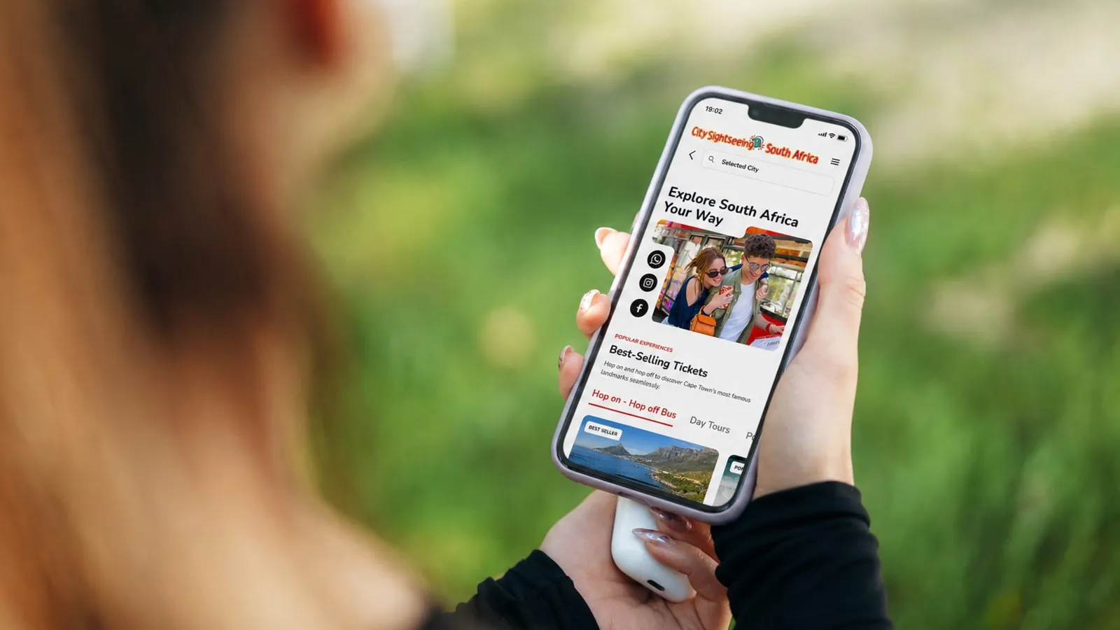
City Sightseeing didn't need a website that told people Cape Town is beautiful. Their customers already know. They're standing in it. What they needed was a site that answers the next question before it's asked: which ticket, what's included, where do I get on, and is this the real thing? Fresh and inviting was the brief. Clear and trustworthy was the work.